EGO Bookkeeping Services
From numbers numb
to joyful sums.

Big ideas, real impact.
A closer look at the problem, the thinking behind the work, and what changed once it was out in the world.
-
The Situation
Give a bookkeeping brand a visual identity loud enough to break the category's habit of playing it safe: a look that shouts, not whispers.
The Problem
Bookkeeping and finance brands default to conservative, muted identities. EGO wanted the opposite: colour and personality clients would actually remember, without losing the trust a financial-services brand needs.
The Constraints
The identity had to carry EGO's boldness across every touchpoint a bookkeeping client sees: logo, business card, billboard, poster, and social ad, while still reading as credible enough to hand over your finances to.
-
The Approach
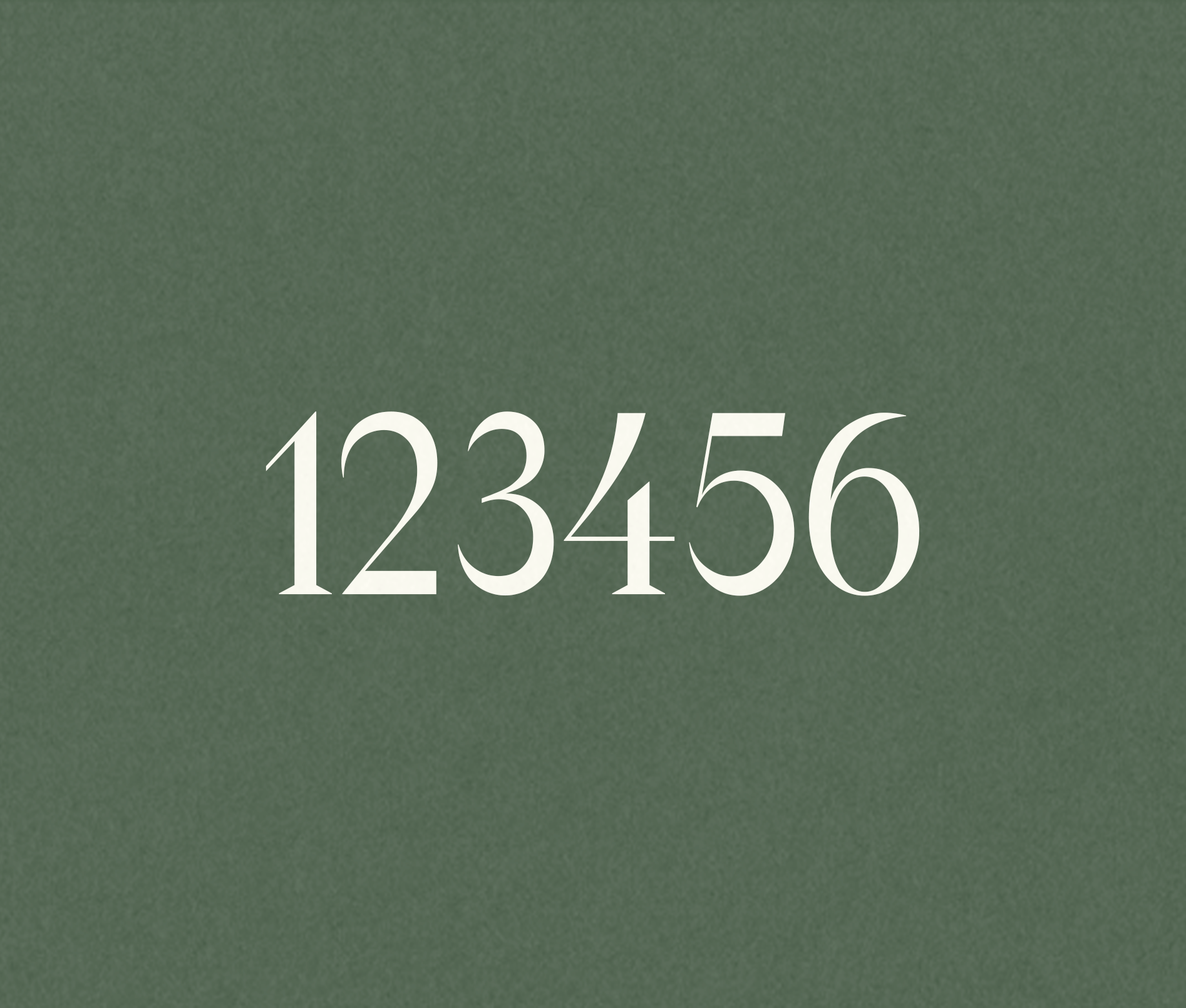
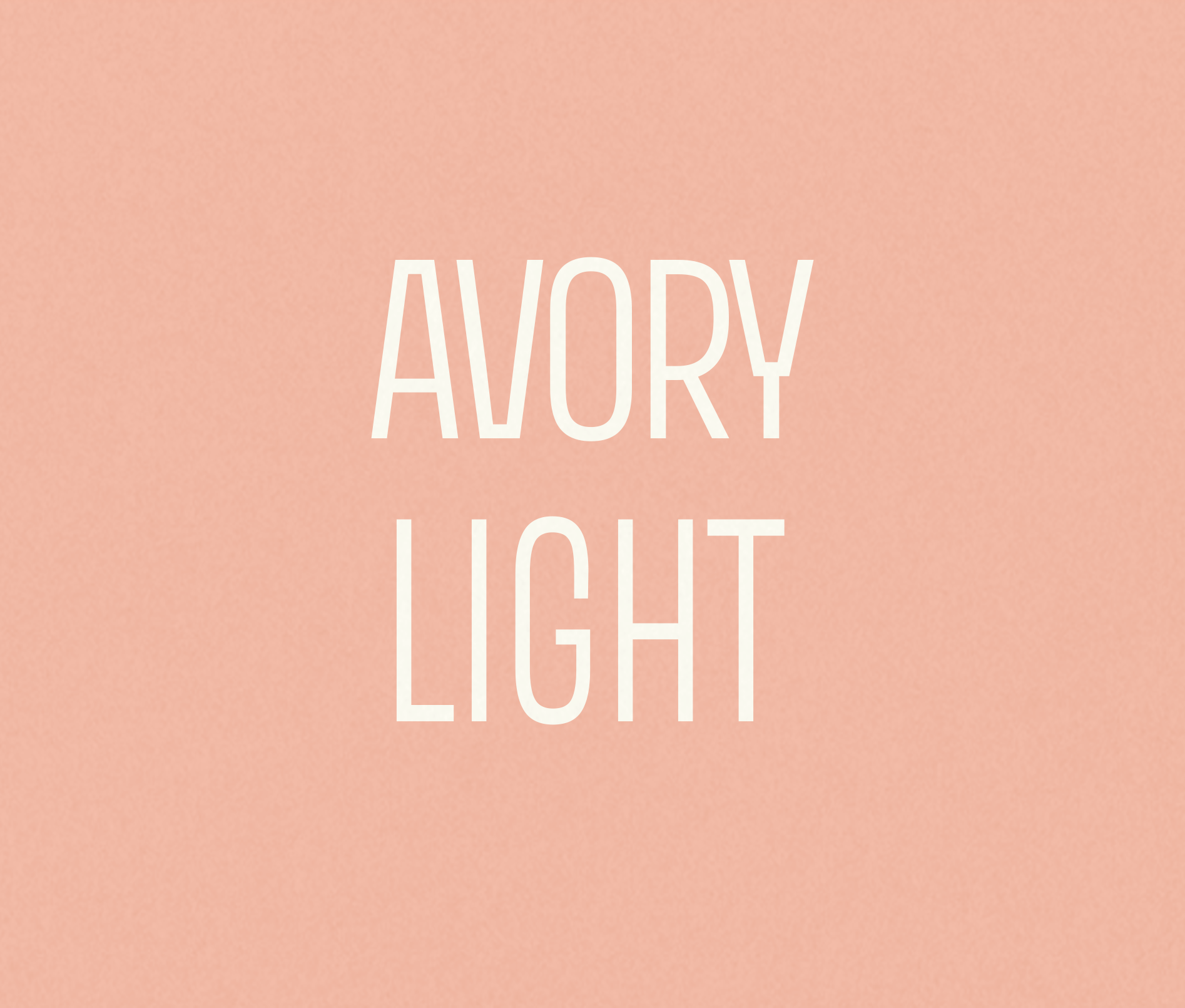
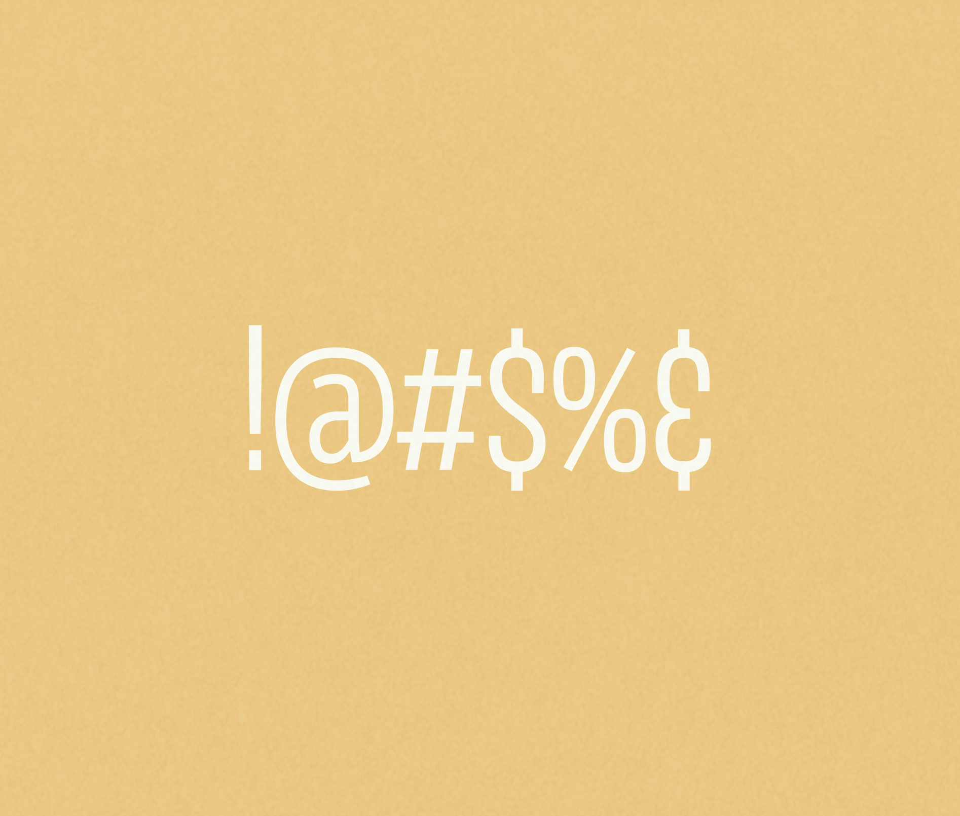
Trade the category's conservative square corners and muted greige for bold, shapely curves and a lively colour palette in yellow and teal. Pair the mark with a custom typography system so the personality carries through, all the way to the numbers themselves. Then change the story the imagery tells: instead of the familiar scenes of stressed clients drowning in receipts, show the relief and joy of clients who've handed the numbers off. The faces of EGO freedom.
The Product
Visual identity for EGO Bookkeeping Services: logo (yellow and teal versions), business cards, a custom typography system, billboards, posters, digital and social ads, and campaign photography direction.
The Role
Art Director/Graphic Designer & Copywriter
Team
Cora Brown + Elle Orser, Founder & Lead Bookkeeper
Timeline
Identity and typography system, then print and digital collateral, then campaign rollout.
-
The Delivery
A full identity system built to stand out in a category built on sameness: logo, typography, print and digital collateral, and a campaign anchored in genuine client relief instead of the usual financial-stress cliche.
The Outcome
Elle Orser: Cora "took our rough ideas and turned them into a stunning, modern, and bold company logo alongside a full suite of marketing materials," calling the result "better than we ever could have imagined."
Having an EGO is better.
Ego - Visual Identity, Logo
Art Director/Graphic Designer, Cora Brown


Who said finance had to be monochrome? Certainly not EGO! Tired of the same old bookkeeping blandness, they tasked me with creating a visual identity that shouts, not whispers.

Curves & colour.
Bookkeeping? More like book-leaping into a world of colour and charisma! EGO is a not-your-average bean counter. No more conservative square corners and muted greige; we embraced bold shapely curves, lively colours, and a dash of daring.

Flash your EGO.
Ego - Visual Identity, Business Cards
Art Director/Graphic Designer, Cora Brown
Font it up.

EGO's client glow-up.
EGO - Visual Identity, Billboards
Art Director/Graphic Designer & Copywriter, Cora Brown

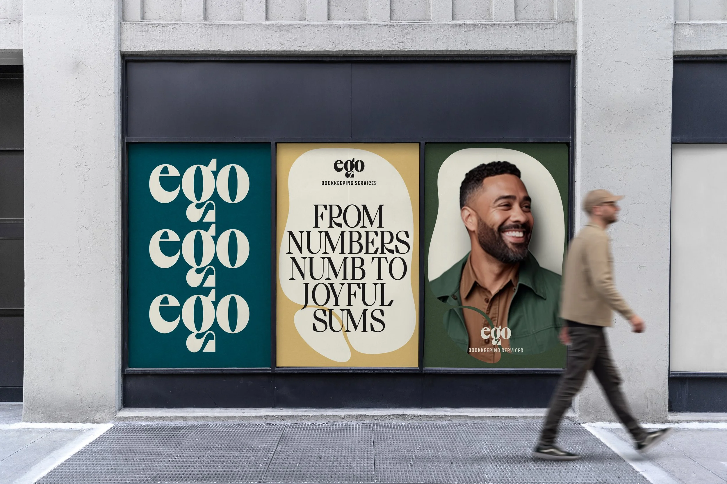
With EGO, it's not just about numbers; it's about making every figure and every colour count.
Insta-Impact.
EGO - Visual Identity, Digital Ads
Art Director/Graphic Designer & Copywriter, Cora Brown


The faces of EGO freedom.
Instead of depicting the all-too-familiar scenes of dejected individuals and business owners grappling with their day-to-day bookkeeping or the annual tax-time dread, we chose a different narrative. Picture the satisfied clients of EGO Bookkeeping Services—there's genuine joy in their smiles, and relief in their expressions. Let's showcase the uplifted spirits of those who've shed the burden of numbers and accounts, all thanks to our service.
Elle Orser, EGO Bookkeeping Services, Founder & Lead Bookkeeper