Woodward Group
Tradition, tightened.

When the “W” starts to wander.
After decades in business, Woodward’s iconic red “W” was everywhere—from marine to aviation to fuel and beyond. The problem? Each of their 11 sub‑brands was giving that “W” its own… interpretation. Fonts were freelancing. Colours were drifting. And the mark itself was starting to lose its sharp edge. That’s when I got called in, not to reinvent the “W,” but to tighten it, align it, and bring the whole family of brands back into sync.
Respect the roots.
Refine the form.
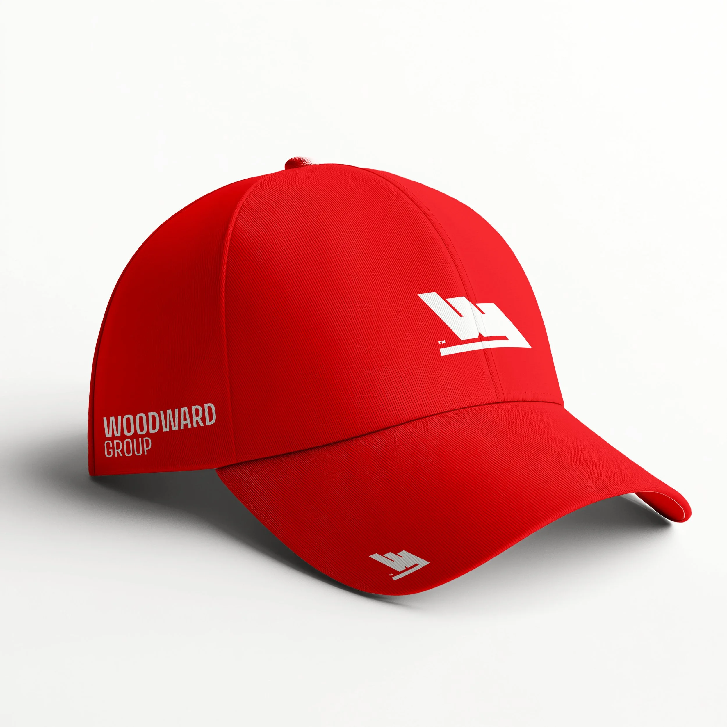
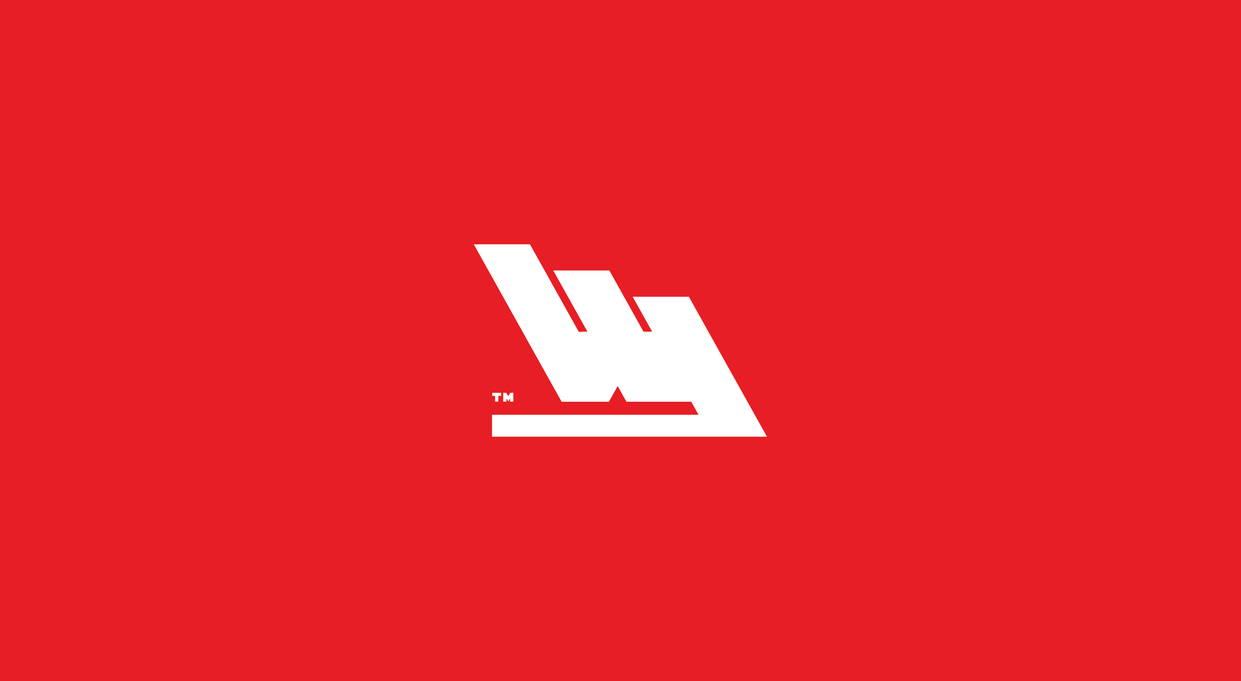
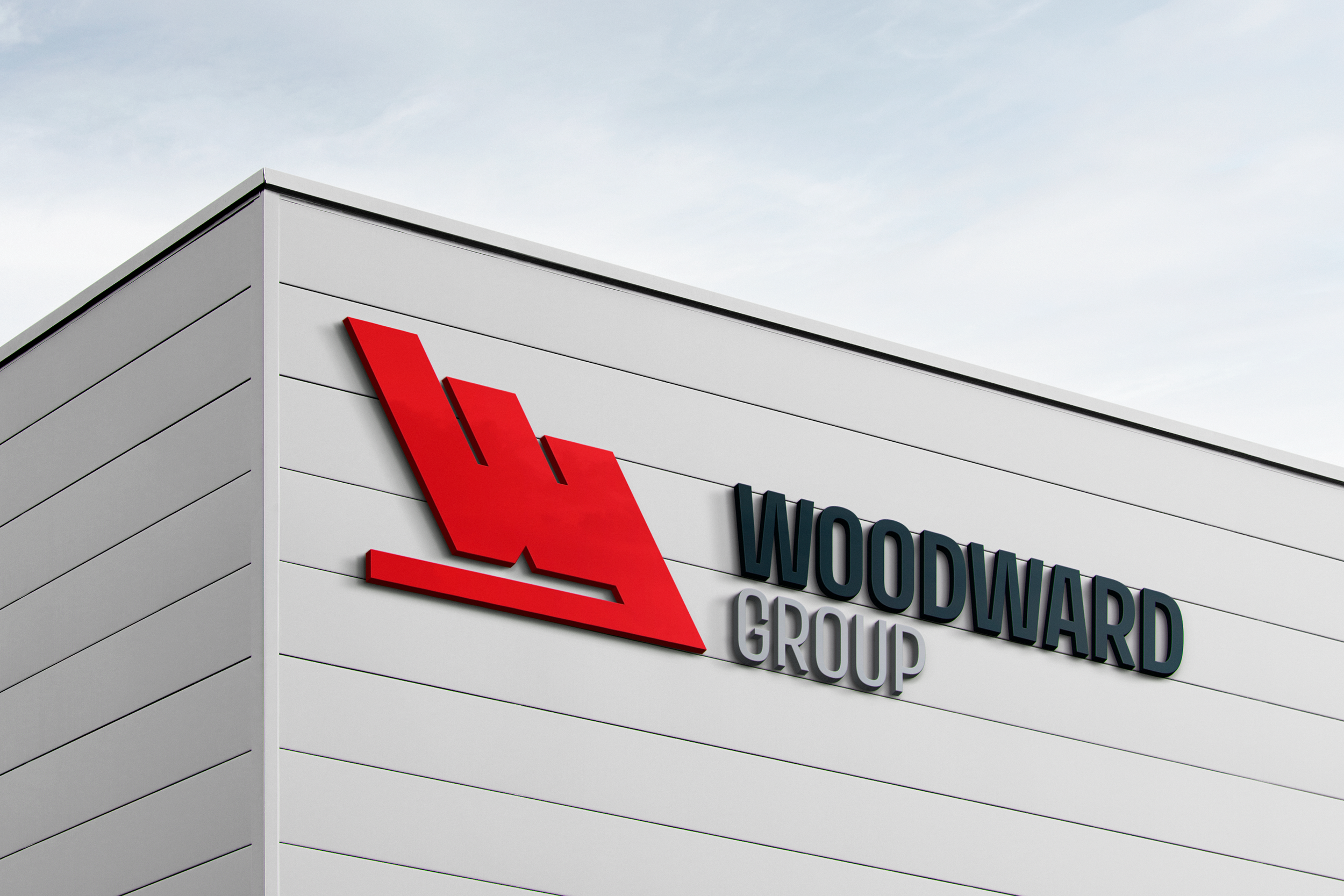
The iconic Woodward “W” wasn’t going anywhere—and it shouldn’t. But decades of use (and 11 sub‑brands interpreting it their own way) left it feeling a little inconsistent. I refined stroke widths for balance, opened the counters for better clarity, and adjusted proportions for a sharper, more versatile mark. The result keeps the heritage intact while making sure the “W” performs flawlessly across every platform and application.


Meet Avory, the equally Edgy sibling.
With sharp corners and geometric forms that mirror the mark’s brutalist edge, Avory | PE Variable doesn’t sit beside the “W”; it stands shoulder‑to‑shoulder. The weight range gives plenty of room for hierarchy, but the core personality is pure precision—perfectly in tune with Woodward’s refined identity.