Woodward Group
Tradition, tightened.

The W, Recalibrated.
After decades at sea, in the air, and across the North Atlantic, Woodward’s iconic red “W” had weathered some waves. It was recognizable, but fractured — each division adding its own spin. Fonts freelanced. Colours drifted. The mark itself softened. My role wasn’t to reinvent the “W,” but to sharpen it, realign it, and rebuild a system strong enough to hold the weight of eleven sub-brands.
One Group.
Too Many Identities.
Woodward Group spans shipping, aviation, fuel, construction, and more. The challenge? Every division spoke a slightly different visual language. What was once a unifying “W” had become a game of telephone. To move forward, the brand needed one voice, one system, one standard.
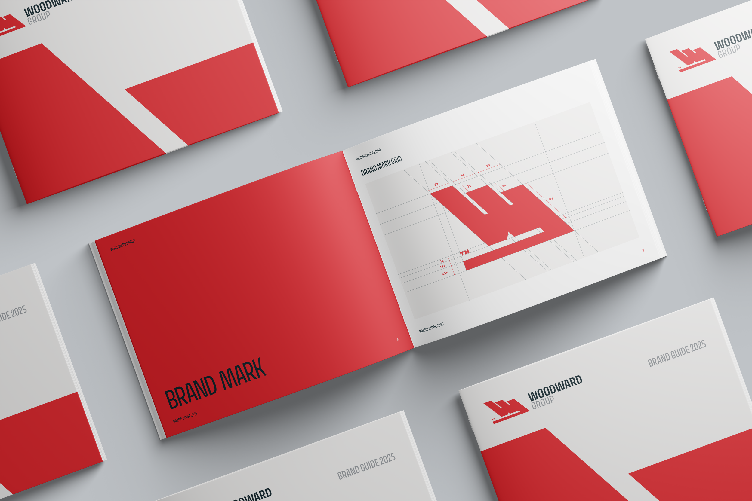
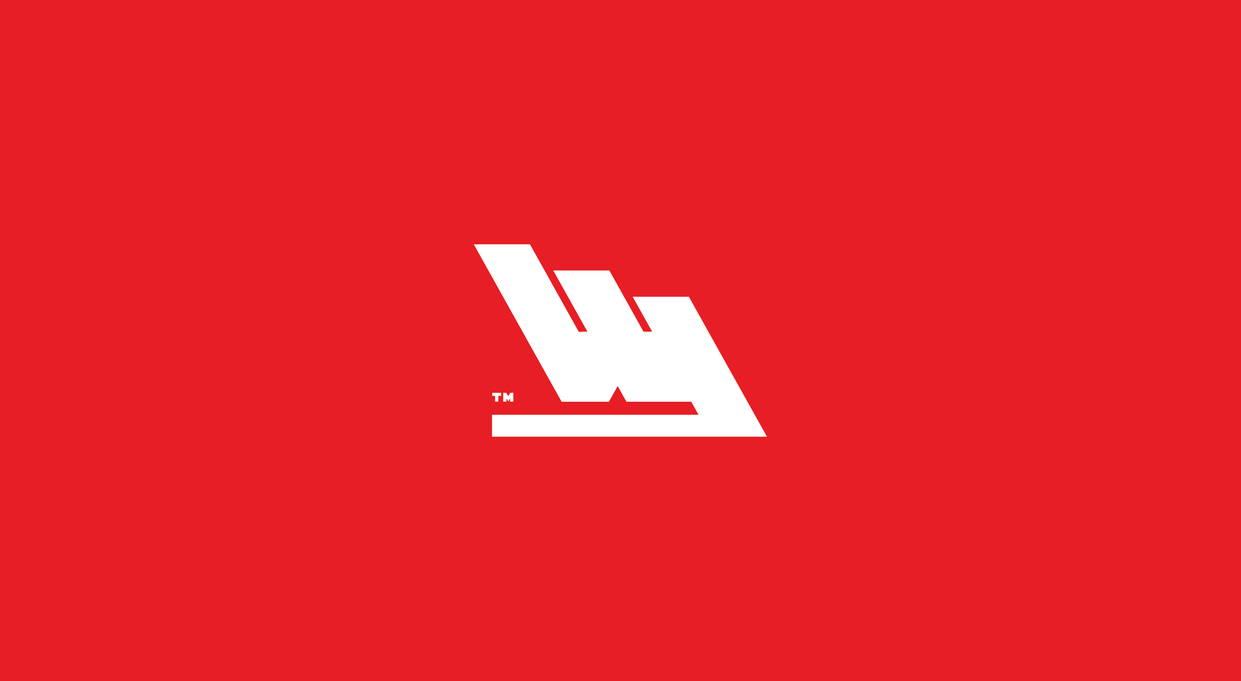
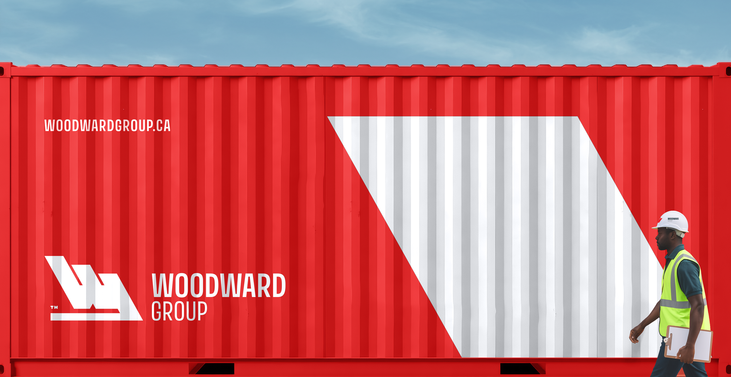
A Mark That Holds Its Course.
The updated “W” is engineered, not just drawn. Its geometry is sharper, its edges truer, its balance deliberate. We built a system where the logo is no longer up for interpretation — it’s the anchor. From there, typography and colour extend the system with precision, creating a foundation flexible enough to handle every division.


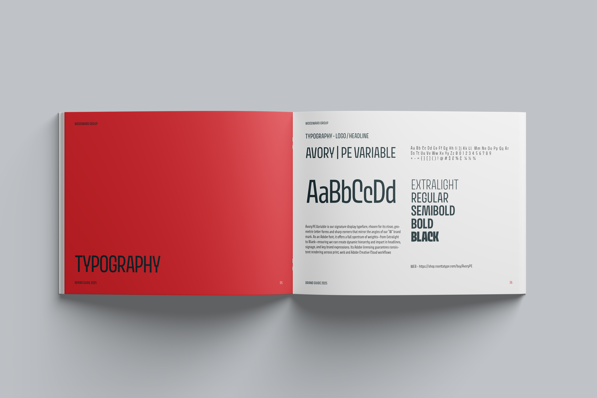
Meet Avory, the equally Edgy sibling.
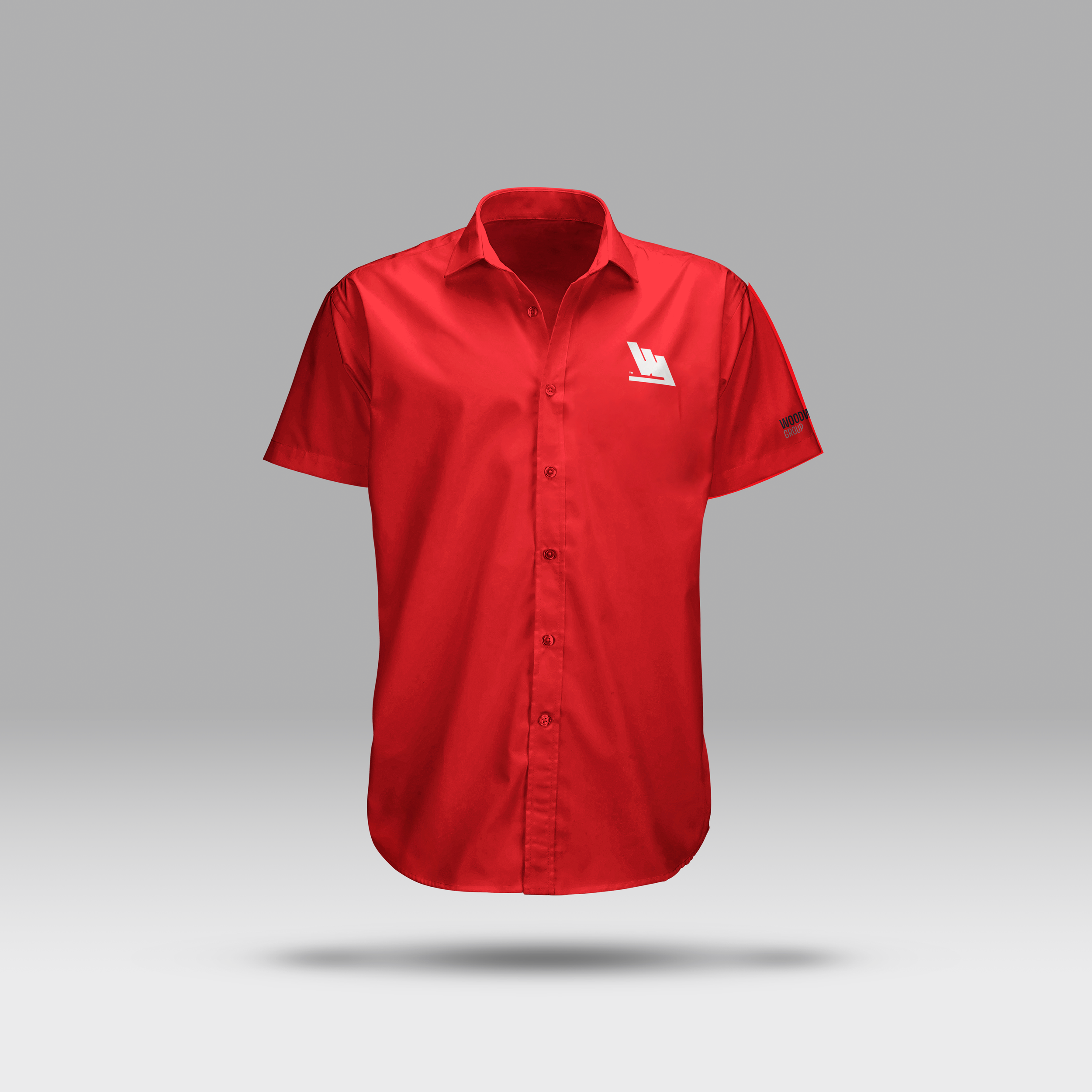
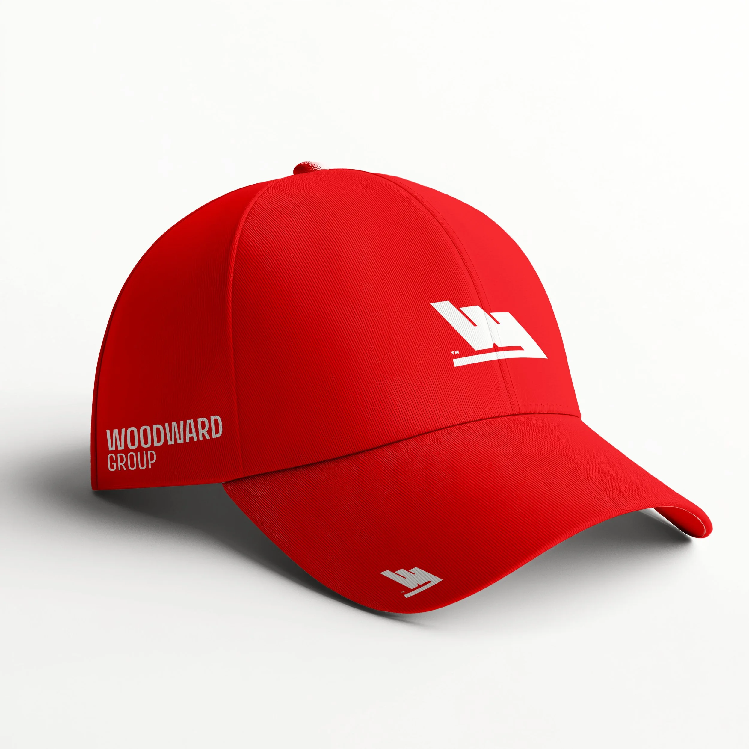
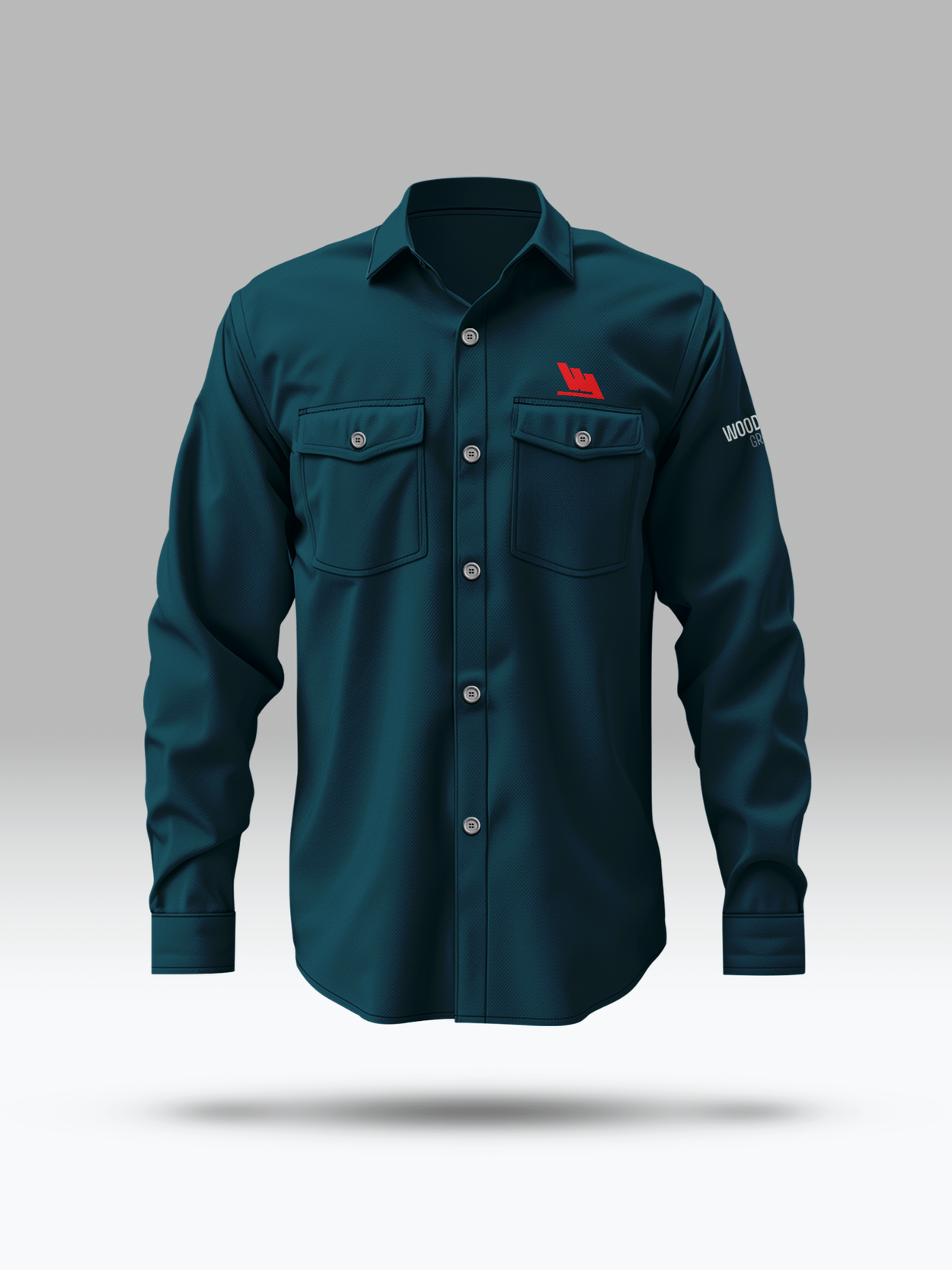
For Woodward, typography had to do more than fill space — it had to carry weight. Avory PE Variable became the voice: clean, geometric, and strong enough to live beside the “W” without competing. The colour palette, grounded in core red and balanced by a deep Atlantic blue, keeps the system cohesive across everything from a safety vest to a shipping invoice.

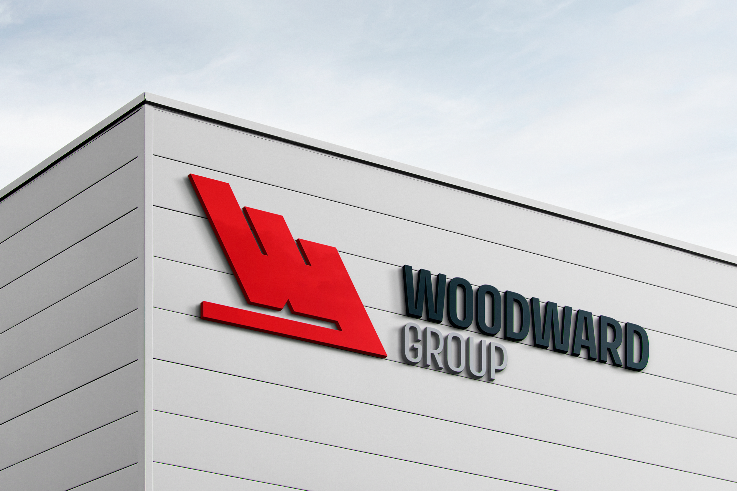
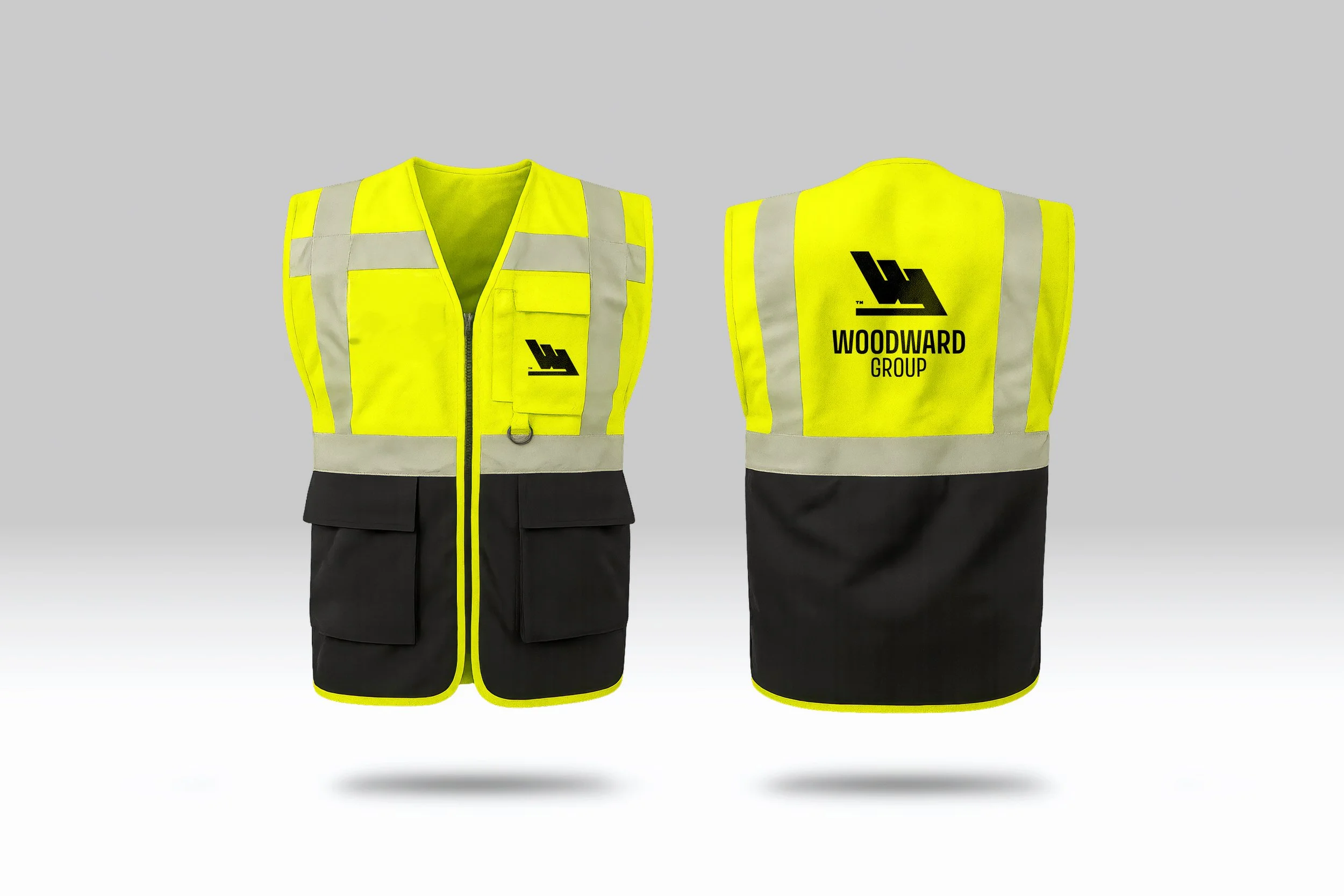
From Letterhead to Lifeline.
A brand only matters if it works in the real world. For Woodward, that meant business cards that feel credible, letterhead that signals professionalism, signage that can weather the elements, and safety gear that employees wear with pride. Every application reinforces the system — consistent, clear, and instantly recognizable.


Patrick Molloy, Vice President - Holyrood Trail Association
“Cora’s process was a game-changer. Her thought-provoking questions helped us define our identity, and she delivered designs we absolutely loved.”
Colin Winn, Writer, Creative Director, Brand Revitalizer & Founder of West Rouge Photography