FSTR Endurance
Endurance is the brand.
Big ideas, real impact.
A closer look at the problem, the thinking behind the work, and what changed once it was out in the world.
-
The Situation
Create a brand for a free running club that could generate its own funding through high-quality apparel sales, without looking like typical charity-run freebies.
The Problem
Fund a growing free track and interval-running club through merchandise people would actually choose to wear.
The Constraints
A passion project with no traditional brand budget. Make the merchandise desirable enough to wear as athletic gear, without generic charity-run visual clichés or unnecessary production.
-
The Approach
Lean the heritage vintage-serif structure forward, add aerodynamic fins, and build a sharp identity system that people would proudly wear even if they weren't running. The identity expands from an abbreviated mark to a full badge and a charging panther.
The Product
Brand identity, heritage badge, and high-quality merchandise system for a free running club.
The Role
Art Director & Graphic Designer
The Team
Cora Brown + Colin Calvert, Founder & Lead Running Coach
The Timeline
Concept → identity system → first merch drop
-
The Delivery
A cohesive brand and high-quality merchandise line built to fund the club, unite its runners, and give it a professional presence. The apparel looks good long after the finish line, giving the community a stronger foundation to grow from.
The Outcome
A distinct apparel system built to help fund the club, unite its runners, and give the community a professional presence.
It started with a run.
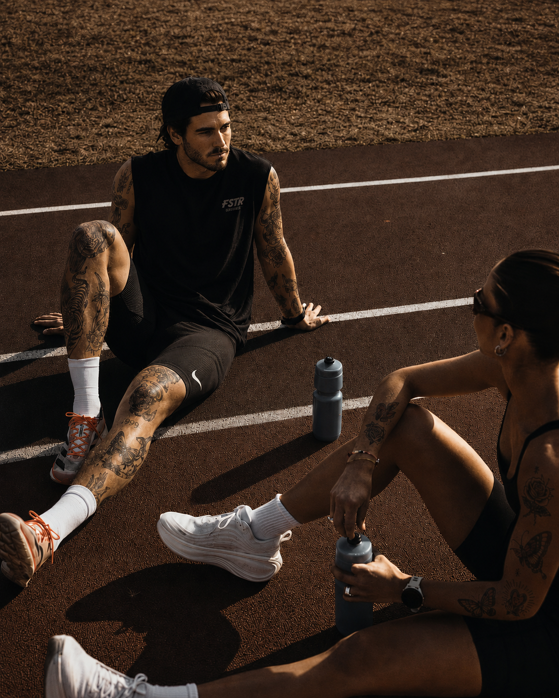
Colin Calvert built FSTR Endurance around a simple idea: serious track and interval training, open to anyone. When the community grew, he needed a way to fund his time. The solution? Merch that people actually wanted to wear.
Built for speed.
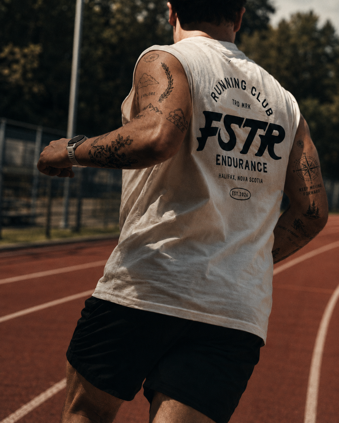
We started with a heritage vintage serif structure and pushed it until it moved. The text was leaned forward to create a sense of momentum, and aerodynamic fins were added to the 'F' and the 'R' — because every letter should earn its keep. The 'S' curves with the kind of fluid confidence that only comes from custom work, and the 'R' kicks out at the heel like it's mid-stride. The result is a mark that looks like it's already running before you even put it on.
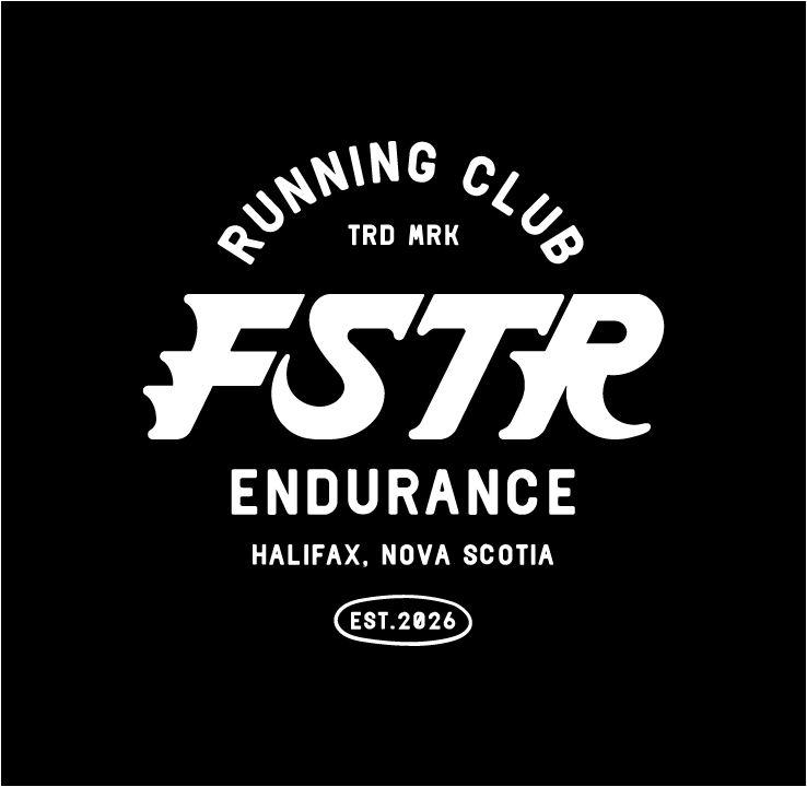
FSTR - Brand Identity, Logo - Art Director/Graphic Designer, Cora Brown.
More marks. More merch.
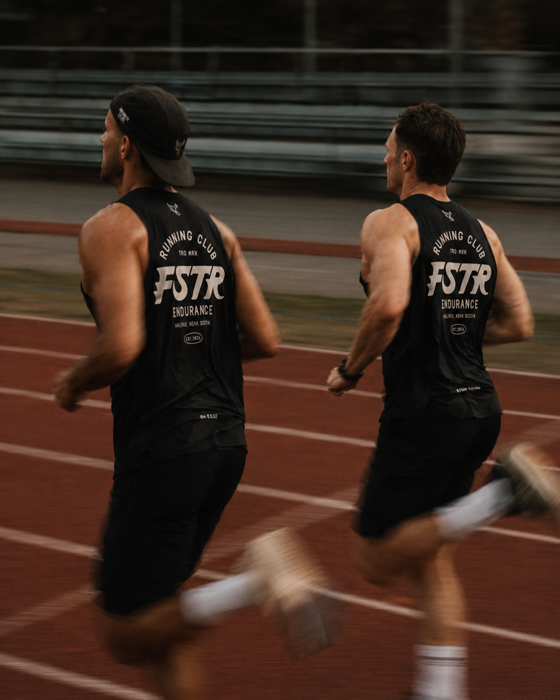
A brand built for a running club needs range. The abbreviated wordmark keeps the energy tight for smaller applications, while the full badge, complete with arched "Running Club" type, location, and EST. 2026, gives the identity its heritage credibility. A charging panther, mid-sprint and trailing fire, takes it somewhere wilder. The FSTR mark earns its place on every piece of gear it touches.
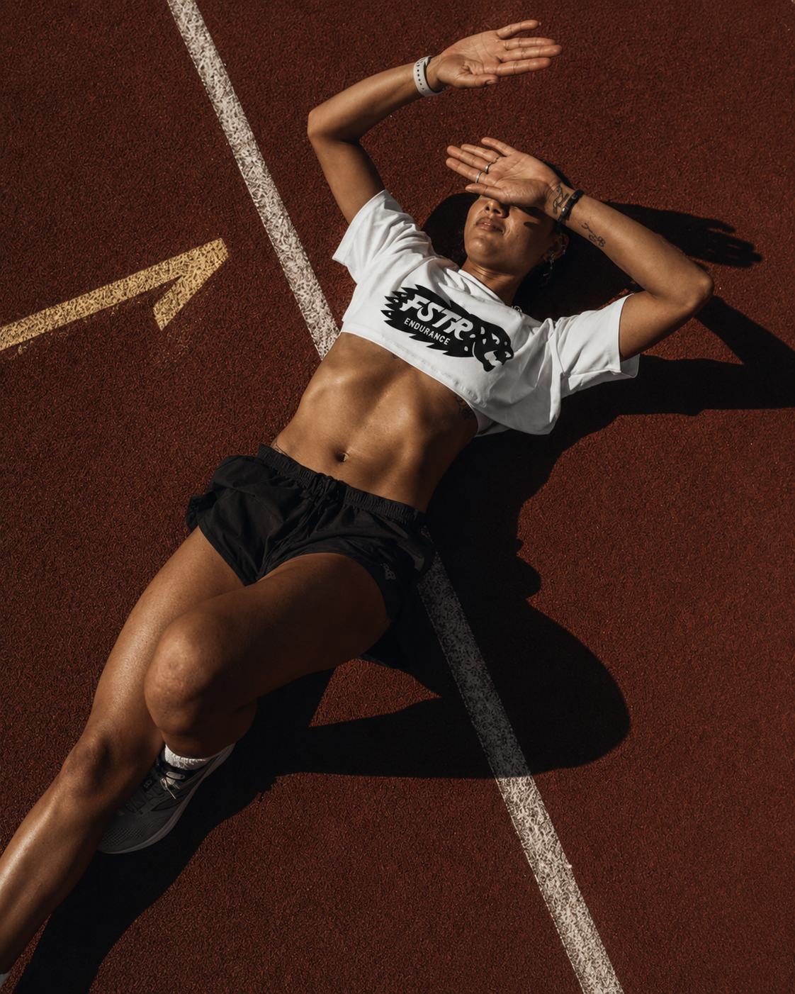


Looks fast. Feels FSTR.
Looks fast. Feels FSTR.
Merch worth running for.
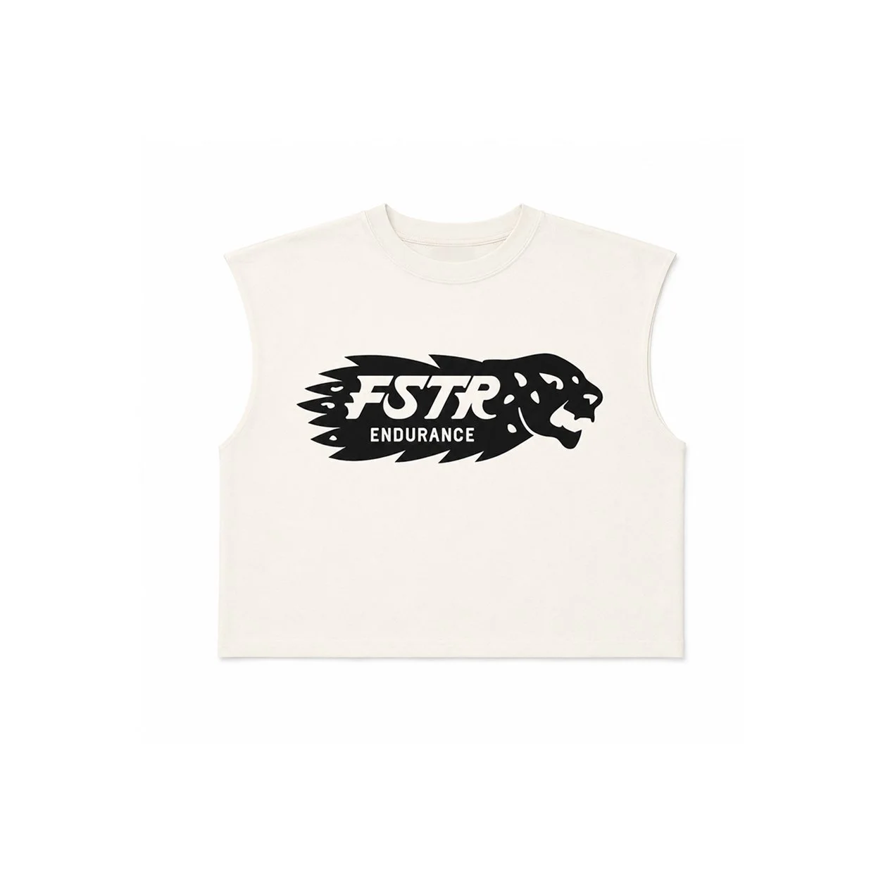
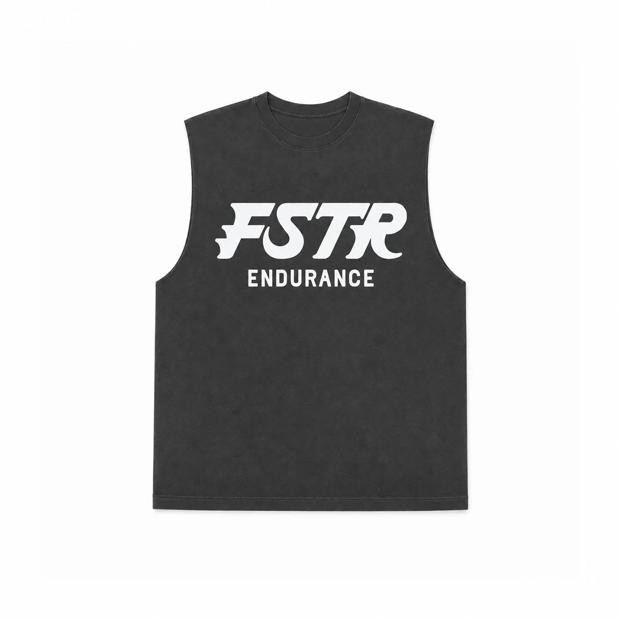
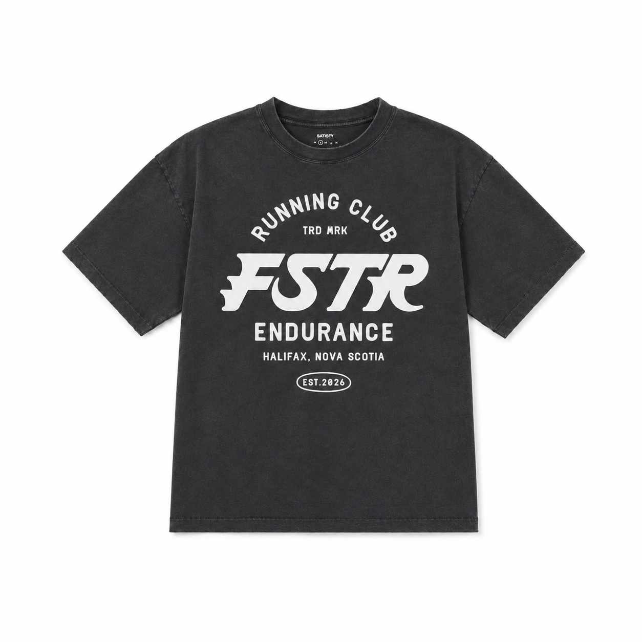
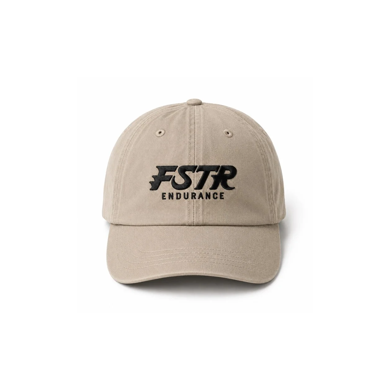
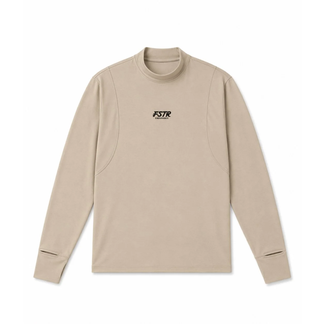
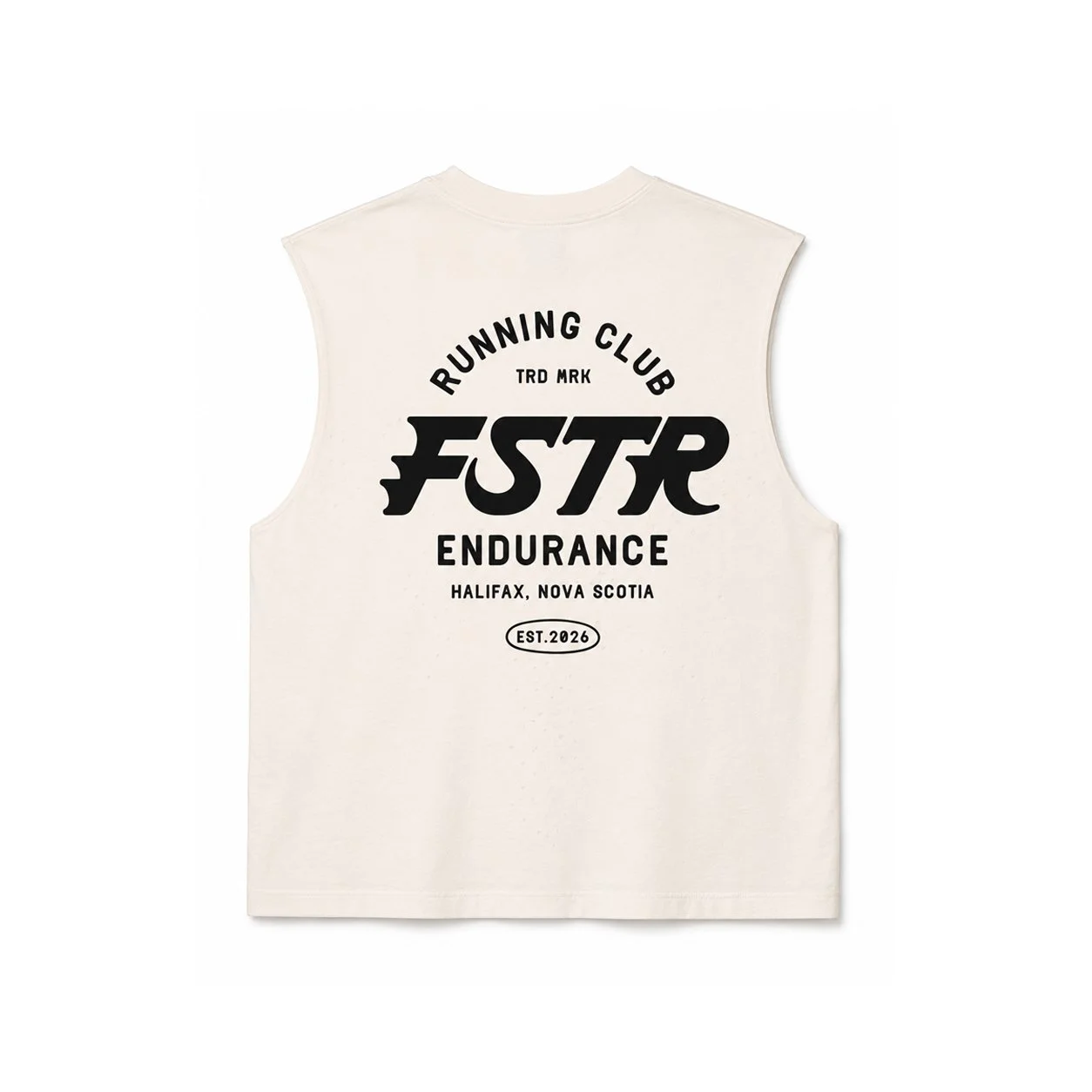
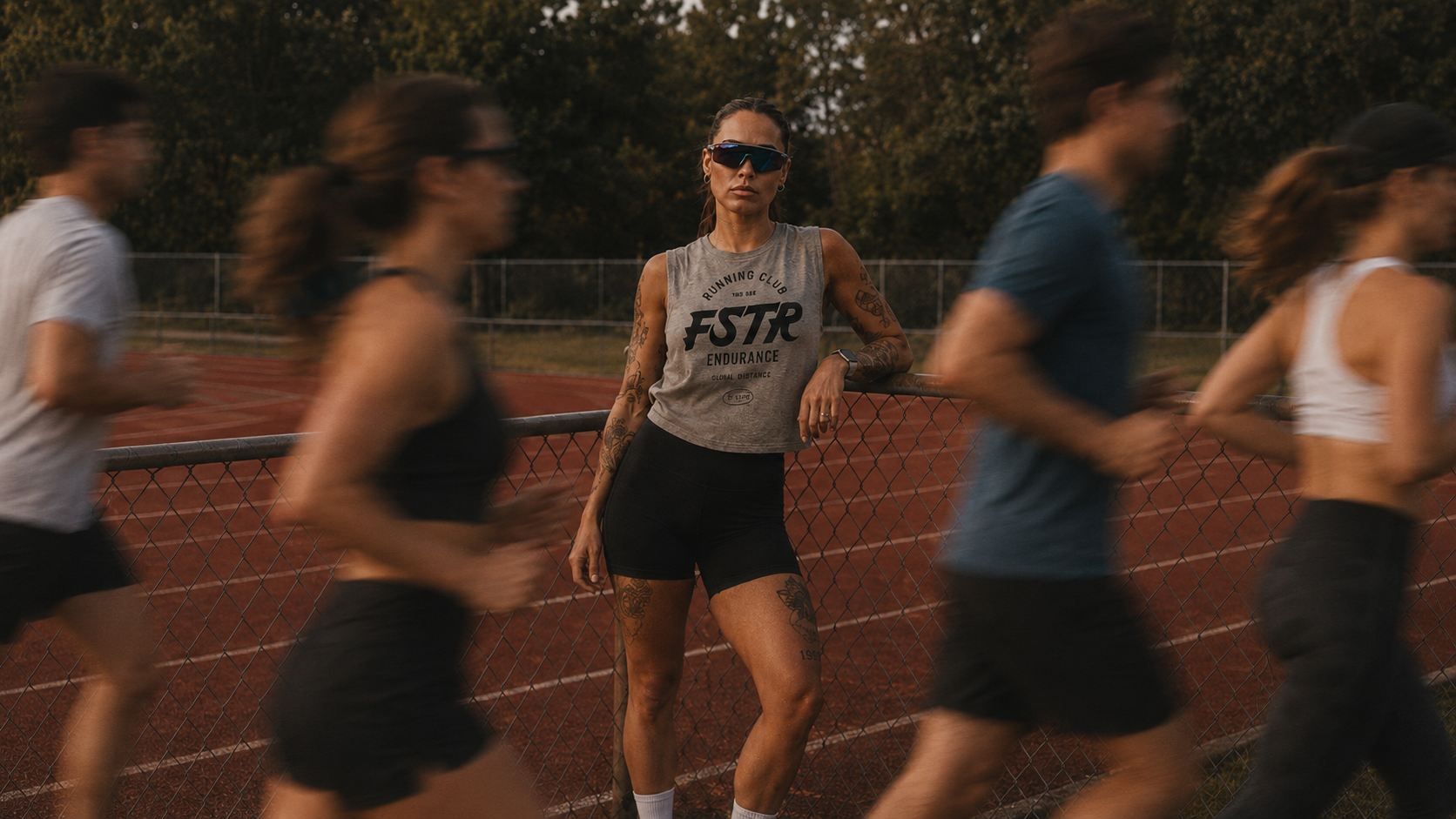
This isn't your average 5K freebie tee. The FSTR identity was designed to live on high-quality gear — from classic tees and muscle tanks to hats and neck gaiters. It's apparel that funds the club, fuels the runners, and looks good long after the finish line.
Limited run. Unlimited attitude.
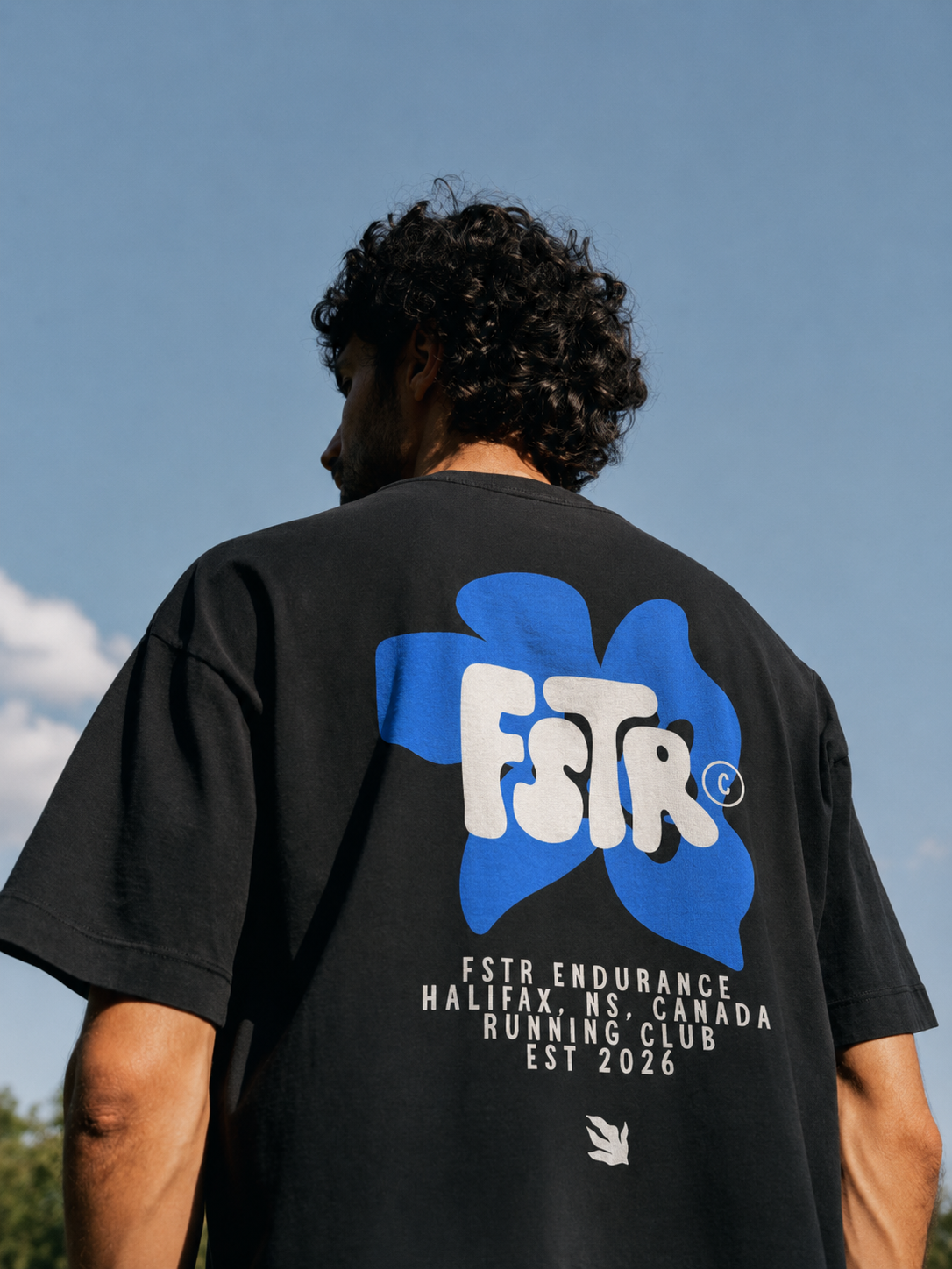
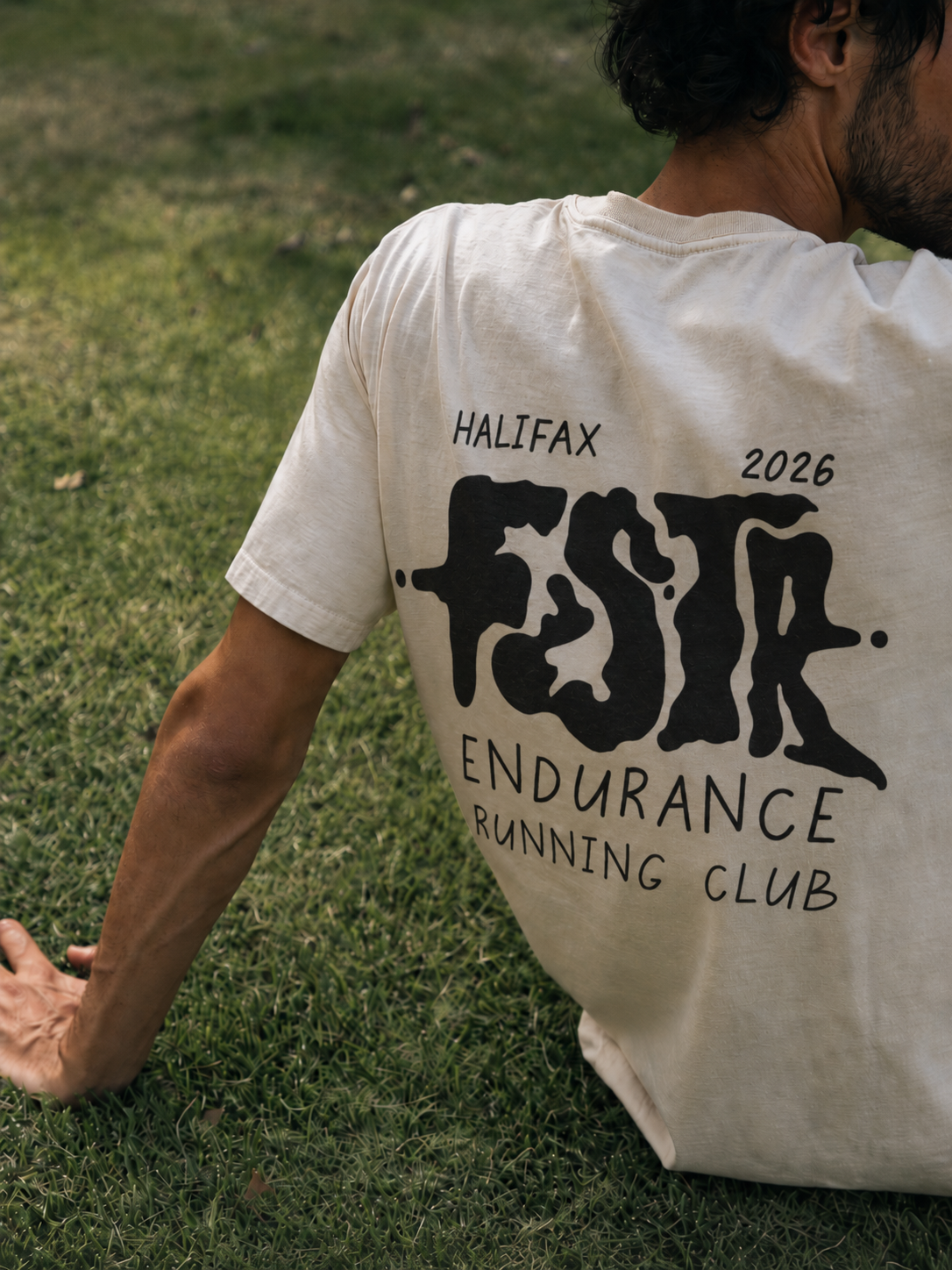
The specialty logos push the FSTR identity in two directions at once. One goes bold and graphic, wrapping the letters in an electric blue floral that's expressive and completely unexpected. The other lets the type melt and drip, giving the mark a raw, hand-done quality that feels like it was made in a back-alley print shop. Two logos. Two moods. One club.
Ready to run with it?
If you've got a big idea that needs a brand to match, I'd love to hear about it.

Colin Calvert, FSTR Endurance, Founder & Lead Running Coach